
Bold moody palettes: Best home décor ideas for your space
Looking to give your home a dramatic, unforgettable edge? Bold moody palettes are the perfect way to add depth, personality, and a touch of sophistication to any room without overwhelming the space.
These rich, daring tones, like deep emerald, navy, charcoal, and plum, create cozy, intimate environments that feel both luxurious and grounded. They’re ideal for anyone ready to move beyond neutrals and embrace expressive design.
Whether through striking accent walls, plush furnishings, or layered textures, moody color schemes invite creativity and emotion into your home. Ready to explore how these powerful hues can redefine your décor?
What Makes Bold Moody Palettes So Alluring?
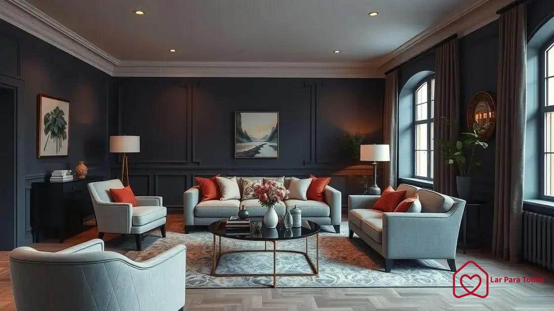
Bold moody palettes are more than just a trendy design choice, they’re a statement.
These rich color schemes draw inspiration from nature, art, and emotion, using deep tones like forest green, navy blue, charcoal gray, and burgundy to create striking, immersive environments.
Unlike lighter palettes, moody colors wrap the space in warmth and drama, turning any room into an experience.
These palettes are perfect for those who want their home to tell a story.
Whether you’re drawn to the mystery of twilight shades or the elegance of jewel tones, bold moody palettes add depth and personality in ways that neutral schemes often can’t. They’re not just beautiful, they’re emotionally resonant.
Choosing these colors isn’t just about aesthetics. It’s about creating a mood, an atmosphere that welcomes you in and encourages you to stay. From cozy corners to statement walls, these palettes can completely shift the energy of your home.
The Emotional Power Behind Dark, Bold Colors
Color psychology plays a powerful role in interior design, especially with bold moody palettes. Darker tones tend to evoke introspection, calm, and sophistication.
Deep greens and blues promote tranquility and focus, while burgundy and plum bring a sense of richness and passion. These colors are ideal for creating a grounded, enveloping space that feels both secure and stylish.
When used intentionally, these shades can influence how you experience a room. A living room painted in deep teal might feel inviting and serene, while a bedroom with dark plum accents could feel luxurious and restful.
The key is to understand the emotional tone you want to set and match the colors accordingly.
Layering these colors with meaningful accents, such as art, lighting, and textured decor, elevates their impact. The result isn’t just visual interest, but a feeling you carry with you every time you enter the space.
Best color combinations for home décor
Choosing the right color combinations is the heart of any successful home décor project, especially when working with bold moody palettes. These color schemes demand attention and intention.
By learning how to harmonize dark, dramatic tones with complementary accents, you can create interiors that feel cohesive, expressive, and undeniably chic.
The beauty of bold moody palettes lies in their ability to balance intensity with subtlety.
When done right, they add drama without overwhelming, warmth without dullness, and sophistication without sterility. It’s all about contrast, layering, and emotional resonance.
To start, think of your palette as a narrative. Each color tells a part of your story, whether that’s comfort, elegance, creativity, or calm. Pairing colors with emotional intent can help you craft a space that feels as good as it looks.
Timeless Foundations with a Moody Twist
Classic neutrals like ivory, soft beige, and smoky gray can serve as grounding elements in a room dominated by moody hues.
Instead of using these colors as the star, they work behind the scenes, offering a quiet balance to bolder tones such as navy, forest green, or eggplant purple.
For example, deep charcoal walls paired with cream furniture can give your living room a luxurious yet approachable feel. A kitchen using matte black cabinetry balanced by pale wood floors offers both edge and elegance.
The secret is in contrast, allowing the moodiness to shine without letting it swallow the room.
Incorporating metallics like brushed gold or bronze can add a refined sparkle, bringing light into darker spaces without compromising the richness of your bold moody palettes. These accents act like punctuation marks, small, intentional, and impactful.
Adventurous Pairings for Personality-Driven Spaces
For those who crave more visual stimulation, experimenting with unconventional color pairings can elevate your interiors.
Burgundy walls can come alive when paired with ochre accessories, while a deep teal backdrop can be energized with touches of amber or rust. These daring duos are perfect for those who see their home as an extension of their personality.
When working with bold combinations, think in layers. Use textiles like velvet or linen to soften strong colors, and let lighting enhance the richness of each hue.
A well-placed table lamp or pendant light can make your chosen shades feel dynamic and alive throughout the day.
The key is not to hold back. If you love a color, find a way to feature it confidently, on a statement wall, a dramatic headboard, or even in your curtains. The emotional impact of bold moody palettes is amplified when the space feels personal and lived-in.
Bringing Nature into the Mix for a Grounded Effect
Nature offers one of the most timeless and intuitive guides when working with bold moody palettes. Shades like olive green, terracotta, slate gray, and sienna mimic earth, stone, and forest tones, bringing a calming energy into your space.
These hues work beautifully together, evoking the tranquility of the outdoors while maintaining an elegant, grounded interior.
Combining natural textures such as raw wood, leather, and woven fabrics further enhances this effect.
A mossy green wall paired with walnut shelving or a clay-colored rug laid over dark oak floors creates a sense of harmony. Adding plants in sculptural pots completes the look, making the space feel fresh and vibrant.
This approach is ideal for bedrooms, reading nooks, and dining areas, places where you want a deeper sense of calm and connection. Bold doesn’t have to mean flashy. Sometimes, it means being unapologetically grounded.
Incorporating textures and materials

Incorporating textures and materials into your home décor can greatly enhance the visual appeal and comfort of your space.
It’s not just about color; texture adds depth and interest, making a room feel more inviting. Let’s explore how to effectively combine various materials in your design.
Mixing Soft and Hard Textures
The contrast between soft and hard textures can create a beautiful balance in any room. For example, plush fabrics like velvet can be paired with sleek materials such as glass or metal.
This mix provides a dynamic look that is interesting to the eye.
- Use soft throws or pillows on a leather sofa for comfort.
- Combine wood accents with smooth ceramics in your decor.
- Layer rugs with different textures to create warmth and depth.
Textures should complement each other while adding to the overall feel of your space. Mixing elements can lead to a more sophisticated appearance.
Natural Materials
Using natural materials is a great way to bring an outdoor vibe into your home. Incorporate elements like wood, stone, and metal to create a warm and organic atmosphere.
Natural materials are timeless and can easily match various design styles.
Consider wooden furniture that displays its grain for added character and warmth. Stone surfaces, like granite or marble, can serve as stunning focal points in kitchens or bathrooms.
By choosing these materials, you also introduce a sense of tranquility and connection to nature.
Textural Accents
Don’t forget about the little accents that can enhance your décor. Items such as woven baskets, textured vases, or decorative tiles can add personality to your space.
These accents work beautifully in combination with larger furniture pieces and can be switched out easily for seasonal updates.
Creating contrast with textures and materials can turn an ordinary space into a captivating one. Use texture strategically to guide the eye and invite touch, ensuring that your home feels both stylish and lived-in.
Selecting the right materials with intentionality will elevate your décor and reflect your unique style.
For more local inspiration and emerging design trends, platforms like Decorex Africa offer curated exhibitions showcasing how bold moody palettes are transforming modern South African homes.
How to Choose Furniture That Enhances Bold Moody Palettes
When designing a space around bold moody palettes, furniture becomes more than a functional necessity, it becomes a visual anchor.
The right pieces help define the mood, support the color story, and introduce balance. Whether you’re leaning into dark, dramatic tones or layering multiple deep hues, your furniture should elevate the atmosphere without overwhelming it.
Bold palettes demand intention. That doesn’t mean every piece must be daring or vibrant.
Instead, furniture should feel cohesive, either by complementing the dominant colors or by adding contrast through shape, material, and finish. Achieving that harmony starts with understanding how to pair form with function.
Emphasizing Shape and Form
When working with bold moody palettes, the shape of your furniture plays a critical role in reinforcing the overall aesthetic. Clean lines and geometric forms offer a modern contrast to richly painted walls or heavy drapery.
On the other hand, curved silhouettes and soft edges introduce a sense of comfort and flow, especially in darker spaces that might otherwise feel too rigid or closed in.
Think of how a sculptural armchair or an asymmetrical coffee table can become focal points, offering visual relief while enhancing the design’s depth.
These elements create rhythm throughout the room, guiding the eye and adding personality. A space filled with bold color needs pieces that are just as thoughtfully designed, not necessarily louder, but certainly intentional.
To maximize small areas, opt for multifunctional furniture that brings both form and versatility. Storage ottomans, nesting tables, or modular seating can be both stylish and practical, keeping the room visually clean while embracing the drama of moody tones.
Color Coordination
Color coordination is essential in a bold setting. While the wall color or large décor elements may carry rich, dark hues, furniture can help distribute that intensity.
Neutrals such as warm beige, taupe, stone gray, or even off-white act as grounding tones. These can prevent the palette from becoming too heavy, offering moments of visual breathing room throughout the space.
Accent pieces like an emerald green armchair, a burgundy headboard, or navy blue bar stools can add vibrant notes, especially when used thoughtfully and in conversation with the overall color scheme.
The goal is not to compete with the walls or lighting, but to amplify the richness and emotion of the design.
When choosing furniture to match bold moody palettes, observe how colors shift in different light. Deep shades often take on new dimensions depending on natural light, lamp placement, or even fabric texture.
A chair that looks slate gray in the morning may appear midnight blue by evening.
Accessorizing with bold moody elements
Accessorizing with bold moody elements can dramatically transform your space, adding personality and depth. The right accessories can pull your entire design together, enhancing your chosen color palette and theme.
Let’s explore how to effectively incorporate these striking elements into your décor.
Statement Pieces
Incorporating statement pieces is an effective way to express your style. These can be large art pieces, unique sculptures, or even bold furniture.
A large painting in deep hues can serve as a focal point, drawing attention and setting the tone for the room.
- Choose art that reflects your personality.
- Use bold vases in rich colors to add interest.
- Incorporate oversized decorative pillows in textured fabrics.
Statement pieces should complement the overall theme while providing a touch of drama to your space.
Creating a Color Palette
Your accessories should work cohesively with your selected color palette. Using colors that contrast with your bold moody tones can create an inviting atmosphere.
For instance, deep blues and rich burgundies pair well with metallic gold or silver accents.
When accessorizing, think about how colors speak to one another. Even small touches like candles, books, or decorative bowls in complementary shades can enhance the overall look.
Don’t hesitate to experiment with accessories until you find the perfect balance.
Mastering the art of accessorizing with bold moody elements involves creativity and experimentation.
By selecting statement pieces, layering textures, and curating a cohesive color palette, you can create a stunning environment that reflects your unique style and keeps your space feeling vibrant and inviting.
Did you like the tips? Continue on our website and read How to create an amazing game room!
FAQ – Frequently Asked Questions about Bold Moody Home Décor
How can I start incorporating bold moody elements into my home?
Begin by choosing a color palette that reflects bold colors and textures. Use statement pieces and layered textiles to enhance your décor.
What types of accessories work best with bold designs?
Look for statement art, unique sculptures, and textured textiles like pillows and throws that complement your chosen color scheme.
Can I mix different materials in bold moody décor?
Yes! Mixing materials like metal, wood, and fabric adds depth and interest to your space, creating a dynamic and inviting environment.
What should I consider when selecting furniture for bold designs?
Choose furniture that emphasizes shape and form while coordinating with your color palette. Balance bold colors with neutral pieces to prevent overwhelming the space.


