Earthy colour interiors South Africa: a new trend
Advertisements
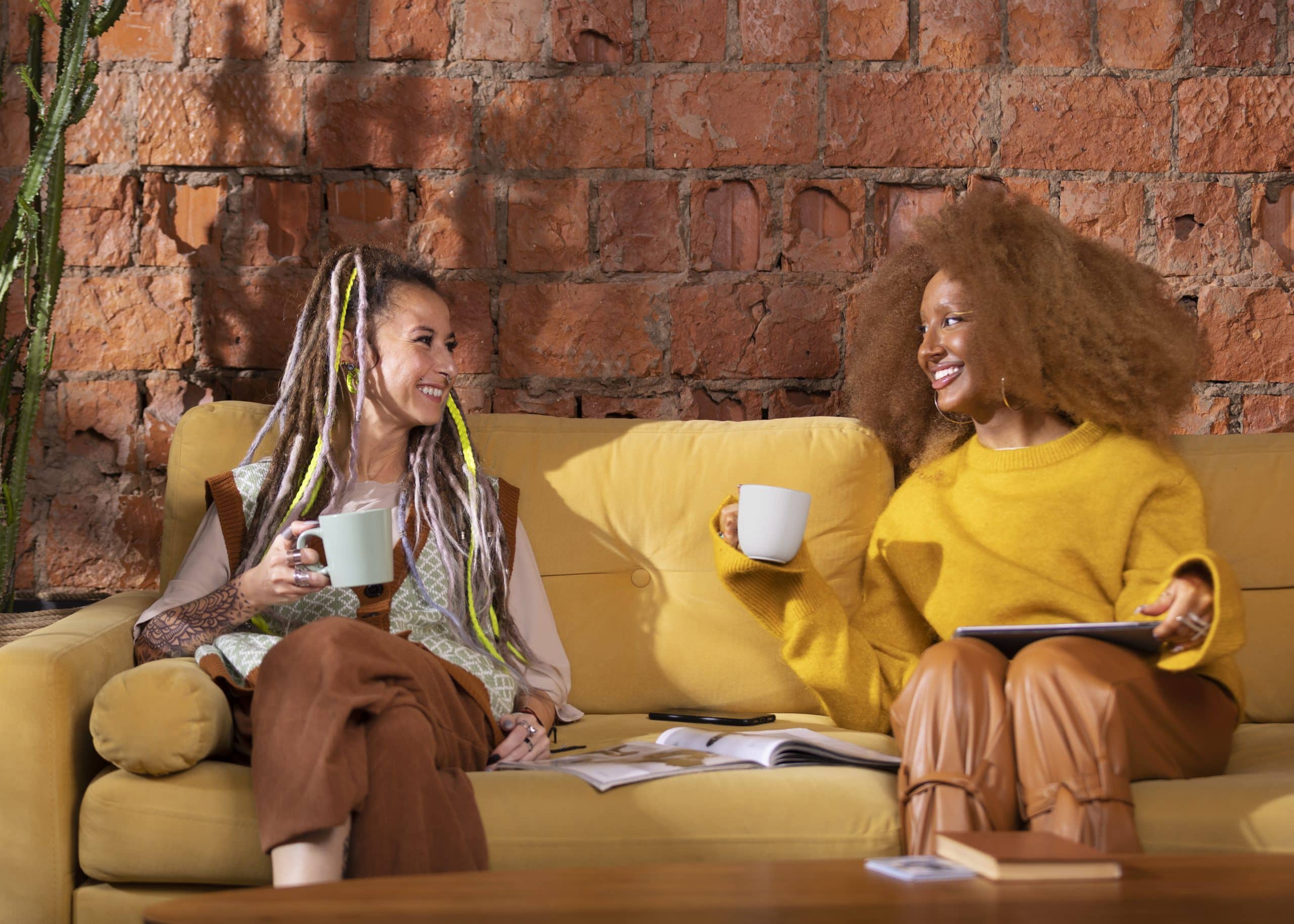
Earthy colour interiors South Africa are evolving in 2026 through fynbos greens, Karoo-inspired clay tones, warm neutrals and materials connected to the local landscape.
The strongest spaces combine colour with timber, stone, linen, woven textures and carefully selected plants rather than covering every surface in one muted palette.
Light, room size and existing finishes determine how these colours actually behave, making testing and balance more important than following a trend literally.
Advertisements
Why Earthy Colours Suit South African Interiors
South Africa offers unusually varied natural references, from the muted vegetation of the Cape to Karoo earth, coastal sand and mineral-rich landscapes.
These influences translate naturally into olive, sage, ochre, terracotta, clay, taupe, stone and warm off-white within contemporary residential interiors.
In 2026, the direction feels increasingly local rather than simply reproducing the generic beige interiors that dominated international design imagery for years.
South African Design Is Moving Beyond Beige
Neutral interiors remain useful, but stronger greens, desert tones and landscape-inspired shades are bringing greater depth into homes this year.
Muted colour can still function almost like a neutral when repeated across cabinetry, upholstery or large wall surfaces without becoming visually aggressive.
The result feels grounded and contemporary while maintaining enough warmth to work with timber, stone and handcrafted decorative pieces.
Place Matters More Than a Fixed Trend Formula
A coastal apartment in Cape Town may respond differently to earthy colour than a Johannesburg home or property surrounded by dry inland vegetation.
Local architecture, outdoor views and available light can provide better palette inspiration than copying a room photographed in another climate.
This place-based approach gives earthy interiors character instead of turning them into another interchangeable social-media design formula.
Fynbos Green Is a Strong 2026 Starting Point
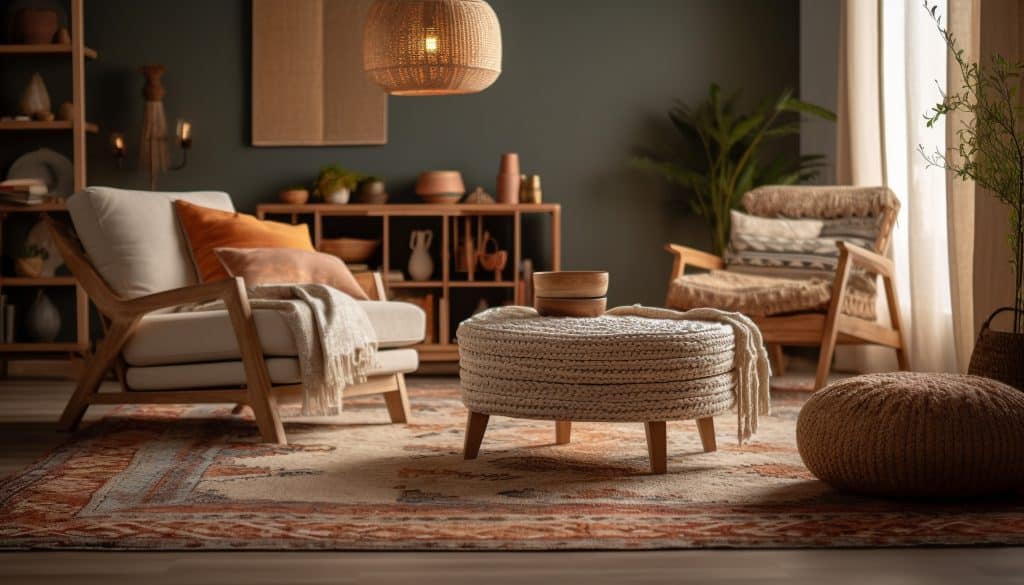
Muted greens inspired by fynbos are among the clearest colour directions appearing in South African interior design during 2026.
Sage, olive, moss and dusty eucalyptus introduce colour while remaining restrained enough to support furniture, art and natural materials.
These tones are especially effective when homeowners want something richer than beige without committing to a highly saturated statement colour.
Use Green as a New Neutral
An olive or sage wall can perform much like a conventional neutral while adding considerably more personality to a room.
Pair it with oak, linen, cream upholstery and textured ceramics to prevent the palette from becoming too dark or visually heavy.
Black metal or deeper timber can then provide definition where the room needs sharper contrast around lighting, frames or furniture.
Bright South African Light Changes Green
Strong daylight can make muted greens appear lighter, warmer or more yellow than they looked on a small paint sample.
A colour that feels calm in a shaded room may become considerably brighter on a north-facing wall exposed to sustained sunlight.
Test large samples at different times of day before committing to cabinetry or an entire room in one shade.
Karoo Tones Bring Warmth Without Excess
Terracotta, clay, rust, ochre and weathered brown bring warmer landscape references into an earthy palette without relying entirely on beige.
These colours work particularly well as accents because even a relatively small area can introduce noticeable warmth into an otherwise restrained room.
They pair naturally with stone, timber and warm white, producing interiors that feel layered rather than heavily decorated.
Terracotta Does Not Need to Cover the Walls
Use terracotta through cushions, ceramics, artwork, rugs or an occasional chair when a full painted wall would feel too dominant.
Smaller accents also make the palette easier to update later because large permanent surfaces can remain more neutral.
This approach is useful in rentals or rooms where architectural features already provide a strong visual focal point.
Ochre Works Well With Olive and Cream
Ochre can bridge green and beige because its warm yellow undertone connects naturally with both vegetation-inspired and sandy colours.
Use it sparingly on textiles or accessories to add energy without breaking the grounded character of the room.
Pairing ochre with muted olive and warm cream creates a richer palette than using several nearly identical beige shades.
Build the Palette Around Three Colour Roles
A cohesive earthy room is easier to design when colours have clear roles rather than every shade competing for equal attention.
Start with one dominant foundation, one secondary natural tone and a smaller accent colour that provides depth or contrast.
This simple hierarchy allows different materials and decorative pieces to coexist without making the space feel visually fragmented.
Choose a Dominant Foundation Colour
Warm white, stone, taupe, light olive or sandy beige can cover the largest surfaces and establish the room’s overall temperature.
The foundation does not have to be bland; it simply needs enough flexibility to support more expressive materials and accent colours.
Flooring and major fixed finishes should also be considered because they already contribute strongly to the visual base.
Add One Stronger Earth-Inspired Accent
Terracotta, deep olive, charcoal brown or muted ochre can provide contrast through one wall, furniture piece or repeated accessory group.
Repeating the accent two or three times across the room creates connection without making every decorative item match exactly.
A good earthy interior feels coordinated, not manufactured as a perfectly matching furniture display.
Texture Prevents Earthy Rooms From Looking Flat
When a palette uses closely related natural shades, texture becomes one of the most important tools for creating visual separation.
Linen, wool, timber grain, woven fibers, ceramics and stone each reflect light differently even when their colours remain similar.
This variation allows a restrained room to feel layered and tactile instead of monotonous or unfinished.
Mix Smooth and Rough Surfaces
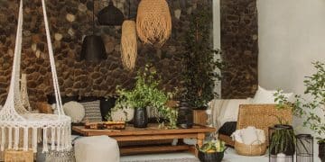
A smooth plastered wall can sit beside irregular stone, woven baskets and visible timber grain without requiring additional bright colour.
Soft upholstery then balances those harder surfaces while creating the comfort expected in bedrooms and living rooms.
The contrast works best when materials share a related warm or muted colour family rather than fighting for attention.
Do Not Add Texture Everywhere
Too many rustic materials can make a contemporary interior feel themed rather than naturally layered and connected to its surroundings.
Use clean surfaces and simple furniture shapes to provide visual breathing room between more tactile decorative elements.
Earthy interiors generally become more sophisticated when texture is deliberately concentrated instead of applied to every available surface.
Wood, Stone and Clay Strengthen the Natural Character
Natural materials reinforce an earthy palette because their inherent variation brings colour and texture into a room simultaneously.
Timber can introduce warmth, stone adds mineral character and ceramic or clay objects can repeat the terracotta shades used elsewhere.
The goal is not to make every item natural but to choose a few materials that establish a convincing connection to place.
Timber Undertones Should Match the Palette
Some woods appear golden, red or cool brown, and these undertones can substantially change how surrounding paint colours look.
Warm oak or similar finishes often pair easily with olive, terracotta, cream and muted ochre in contemporary earthy interiors.
Always compare timber and paint samples together because attractive individual materials can still conflict when combined.
Stone Can Add Quiet Contrast
Travertine-like neutrals, slate tones and locally relevant stone finishes can add variation without introducing another dominant colour family.
Use real stone, engineered alternatives or ceramic finishes according to budget, performance requirements and the room’s practical needs.
A material should be chosen for durability and suitability as well as appearance, especially on floors and heavily used surfaces.
Sustainability Requires More Than Natural Materials
A material being natural does not automatically make it environmentally preferable once extraction, manufacturing, transport and lifespan are considered.
Durable locally produced furniture may provide greater long-term value than an imported item marketed primarily through vague sustainability language.
Reclaimed materials can be useful, but condition, treatment history and fitness for the intended application should still be evaluated.
Prioritise Longevity and Local Craft
Furniture that can remain useful for many years reduces the need to replace complete rooms whenever one design trend changes.
South African makers also provide opportunities to introduce local timber, ceramics, weaving and craftsmanship into contemporary interiors.
This supports a more distinctive design identity while potentially reducing dependence on disposable decorative pieces with very short trend cycles.
Use Existing Furniture Where Possible
An earthy redesign does not require replacing furniture that remains structurally sound simply because its current colour is no longer fashionable.
Reupholstery, refinishing, new hardware or different surrounding colours can change how an existing piece reads within the room.
Working with what is already available can make an interior more personal while reducing unnecessary replacement spending.
Plants Add Greenery but Are Not Air Purifiers
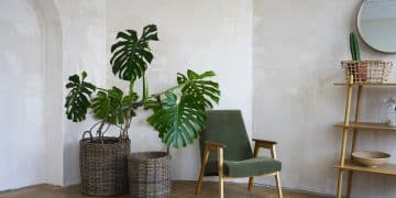
Indoor plants can provide colour, organic form and a stronger visual relationship between interior spaces and the natural environment.
They should not, however, be promoted as a practical replacement for ventilation or purpose-designed air-cleaning systems in normal homes.
Research shows that passive pollutant removal per plant is generally too small to provide substantial real-world purification at ordinary plant densities.
Choose Plants for the Available Light
Plant selection should begin with the actual conditions in the room rather than simply choosing whichever species looks best in photographs.
A bright window can support plants that would struggle in a dim corridor, while direct sun may damage species adapted to filtered light.
Match water requirements and mature size to the location so greenery remains healthy enough to enhance the room long term.
Snake Plants and Pothos Are Generally Adaptable
Snake plants and pothos are frequently selected for interiors because they can tolerate a relatively broad range of household conditions.
That does not mean they require no maintenance, and overwatering remains a common problem for many indoor plants.
Use them primarily for visual texture and greenery rather than making unsupported claims about dramatic improvements to household air quality.
Use Plants as Part of the Colour Palette
Green foliage can function as an accent colour against clay, stone, cream and timber instead of being treated as separate decoration.
Terracotta pots can reinforce warmer tones, while neutral ceramics keep the plant visually connected to a quieter contemporary scheme.
Repeating related container materials throughout the room creates continuity without requiring identical pots in every location.
Group Plants Rather Than Scattering Them Randomly
A group of two or three plants at different heights can create a stronger composition than several isolated pots placed around a room.
Vary leaf scale and shape while keeping containers visually related to prevent the arrangement from feeling chaotic.
Leave enough negative space around the grouping so greenery remains a deliberate focal point rather than background clutter.
Large Plants Need Space to Mature
A fiddle leaf fig or similarly substantial indoor specimen can eventually occupy significantly more visual space than when first purchased.
Consider mature height, width and access to light before positioning a large plant beside furniture or narrow circulation routes.
Choosing scale carefully helps the plant complement the architecture instead of gradually overwhelming the room.
Lighting Can Completely Change Earthy Colours
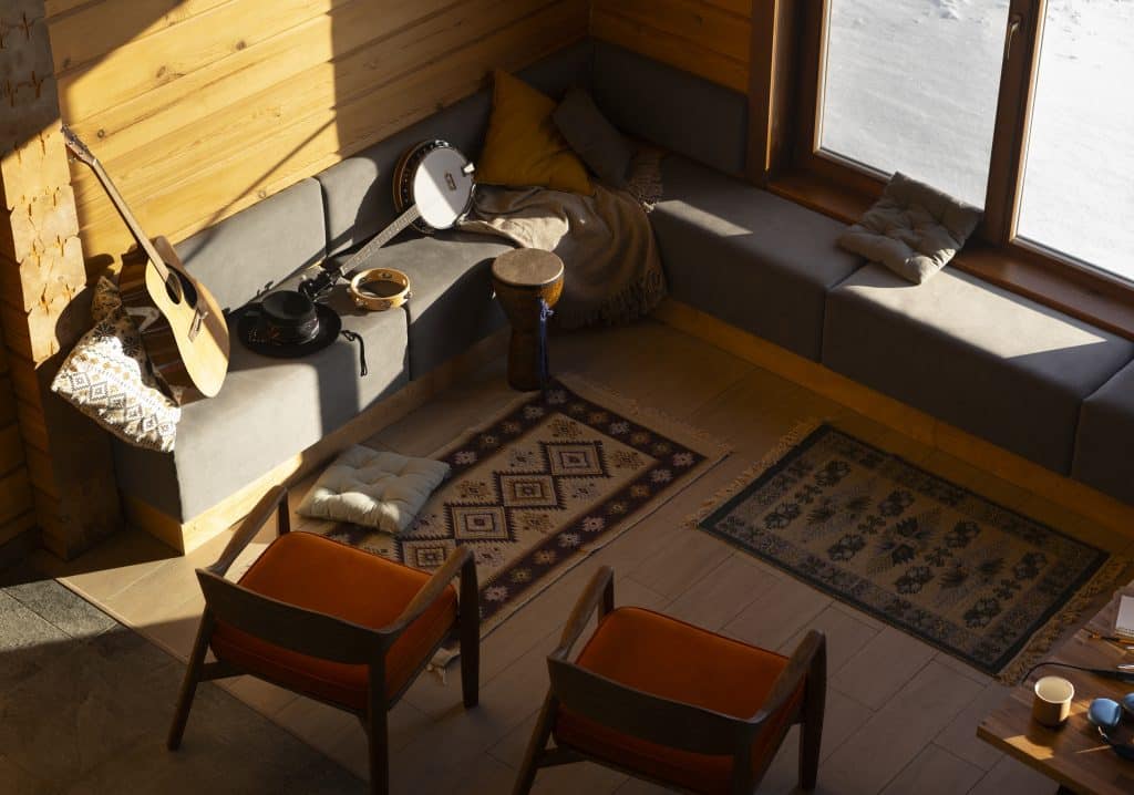
Colour does not exist independently from light, making lighting one of the most important considerations when designing an earthy interior.
Strong daylight can expose hidden yellow, red or green undertones that are difficult to detect under artificial showroom lighting.
Evening illumination can then make the same room feel dramatically warmer depending on lamp colour temperature and fixture placement.
Test Paint on More Than One Wall
A colour facing a bright window may appear noticeably different from the same paint applied inside a shaded corner.
Paint large test areas and observe them during morning, afternoon and evening before making the final selection.
Small sample cards rarely reproduce the visual impact of a colour covering several square metres of wall.
Warm Lighting Supports Clay and Timber
Warm artificial lighting generally reinforces terracotta, timber, ochre and cream while creating a more intimate evening atmosphere.
Very cool lighting can make warm palettes appear duller or create an unintended contrast with natural wood finishes.
Layer ambient, task and accent lighting instead of relying on one central fixture to illuminate the entire room.
Earthy Living Rooms Need Contrast
A living room built entirely from mid-tone beige and brown can quickly lose definition even when every individual item is attractive.
Introduce contrast through darker timber, olive upholstery, artwork or black details while keeping the overall palette connected to natural tones.
This creates visual structure and prevents the earthy aesthetic from becoming an indistinct collection of similarly coloured furniture.
Let One Piece Lead the Room
A sofa, artwork, rug or substantial coffee table can establish the main visual direction before smaller decorative pieces are selected.
Building outward from one strong element usually produces a more coherent result than purchasing several unrelated trend-inspired accessories first.
The focal item does not need to be brightly coloured; scale, texture and craftsmanship can create equal visual impact.
Bedrooms Benefit From Softer Earthy Palettes
Bedrooms often suit quieter combinations such as sage, warm white, mushroom, taupe and muted clay rather than several strong colours together.
Layering bedding and textiles creates enough visual richness without making the sleeping area feel excessively busy.
Wood furniture or woven details can then introduce warmth while maintaining the calm character associated with the palette.
Keep the Largest Surfaces Relatively Calm
Walls, curtains and large bed textiles dominate a bedroom, so restraint on those surfaces makes accent changes easier later.
Use richer colour through cushions, blankets, artwork or a single upholstered piece when the room needs additional depth.
This balance makes the design adaptable without removing the Earthy colour identity established by the larger materials.
Earthy Kitchens Can Be More Than Beige
Olive, muted green and warm timber cabinetry can introduce a strong natural character while remaining sophisticated enough for contemporary kitchens.
Stone-toned surfaces and warm metallic details can complement these colours without pushing the room toward an overly rustic aesthetic.
Because cabinetry is expensive to replace, choose earthy colours that work with the architecture rather than the most extreme version of a trend.
Use Colour Where It Can Age Gracefully
A muted green cabinet generally offers more long-term flexibility than an intensely saturated shade tied closely to one fashion moment.
Keep major countertops and expensive fixed materials compatible with several colour directions so future updates require fewer structural changes.
Smaller accessories, stools and painted details can carry more experimental colour because they are easier to change later.
Create a South African Earthy colour Palette Step by Step
Begin with the colours already present in floors, timber, stone, outdoor views and architectural materials before purchasing new decor.
Select one dominant natural shade, one secondary tone and one accent, then repeat them in different proportions across the room.
Finish with texture, lighting and greenery so the space feels layered rather than simply painted in fashionable earthy colours.
A Fynbos-Inspired Combination
Start with warm off-white walls, add muted sage or olive upholstery and introduce medium-tone oak or similar timber.
Use stone, linen and a small amount of ochre or clay to warm the palette without making it overly colourful.
This combination feels distinctly natural while remaining light enough for many contemporary South African homes.
A Karoo-Inspired Combination
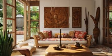
Combine sandy beige with terracotta, weathered brown and soft cream for a warmer interpretation of the Earthy colour interior trend.
Add textured ceramics, timber and woven materials while keeping some surfaces visually simple to prevent the room from feeling excessively rustic.
Muted green can appear in plants or smaller accessories to provide contrast against the warmer desert-inspired shades.
Avoid Turning Earthy colour Into a Theme
A successful Earthy colour room should feel connected to nature without looking like every item was chosen to illustrate the same design concept.
Contemporary furniture, art and personal objects can sit comfortably beside natural textures and prevent the scheme from becoming overly literal.
The most convincing interiors often mix periods and influences while maintaining consistency through colour, proportion and material relationships.
Do Not Copy Every Earthy colour Trend at Once
Terracotta walls, olive cabinetry, jute rugs, stone tables and dozens of plants may each work individually but can become overwhelming together.
Select the elements that suit the architecture and lifestyle rather than attempting to reproduce every popular earthy design signal.
Restraint also makes distinctive handmade pieces and meaningful personal objects easier to notice within the final composition.
Earthy Colour Interiors South Africa: 2026 Priorities
Earthy colour interiors South Africa in 2026 are becoming more expressive, combining landscape references with contemporary materials and stronger local identity.
Fynbos greens, Karoo clay, warm stone shades and natural textures provide flexible foundations rather than one compulsory colour formula.
The most successful approach considers light, material quality, local context and long-term usability before following short-lived decorative trends.
Five Elements Create the Strongest Result
Start with a locally relevant palette, add contrasting natural textures and select materials that will withstand everyday use.
Use plants decoratively, design around the actual daylight and create visual hierarchy through one or two stronger focal elements.
Finally, preserve enough neutral space so colour, craft and texture can remain visible without competing with one another.
FAQ – Frequently Asked Questions About Earthy colour
What are the main earthy colours for South African interiors in 2026?
Fynbos greens, olive, sage, clay, terracotta, ochre, sandy beige, warm stone and muted browns are especially relevant to current South African interiors.
Is beige still popular in 2026?
Yes, but current South African design is moving beyond all-beige spaces toward stronger landscape-inspired greens, desert tones and layered natural materials.
What colours work well with terracotta?
Terracotta pairs effectively with warm cream, sandy beige, olive green, muted ochre, natural timber and selected charcoal or black accents.
Which green works best for Earthy colour?
Sage, olive, moss and dusty eucalyptus are versatile choices, but the best shade depends on the room’s daylight and existing materials.
Do indoor plants really purify household air?
Plants can remove pollutants under controlled conditions, but ordinary quantities of houseplants generally provide too little purification to replace proper ventilation.
What materials work well in an earthy room?
Timber, stone, linen, wool, clay, ceramic and woven fibers can add texture when selected according to durability and the room’s practical requirements.
Are natural materials automatically sustainable?
No. Sustainability depends on sourcing, manufacturing, transport, durability and how long the material or product remains in use.
How can I make an earthy room look modern?
Combine natural colour and texture with clean furniture lines, restrained accessories, contemporary lighting and enough uncluttered visual space.
Where can I find more earthy interior inspiration?
Visual references for earthy interiors can help with palette ideas, but adapt them to your own architecture and local light.
Conclusion
Earthy colour interiors South Africa in 2026 are moving beyond generic beige toward richer fynbos greens, Karoo tones and locally grounded material choices.
Successful rooms combine those colours with texture, natural light, durable materials and carefully placed greenery rather than depending on one trend feature.
Use South Africa’s landscapes as inspiration rather than a rigid formula, and the result can feel contemporary, personal and relevant well beyond 2026.
Author