
How to use bold hues to transform your South African home
How to use bold hues to transform your South African home in 2025 goes beyond just adding color—it’s about sparking creativity and expressing your unique style.
When combined thoughtfully with neutral shades, these vibrant tones bring energy and warmth, enhancing your space with the latest nature-inspired trends.
Imagine turning dull rooms into lively, inspiring spaces that reflect your personality and brighten your daily life. This guide will show you practical ways to embrace bold colors and refresh your home with confidence.
The power of color in home design
Color plays a vital role in home design. It can influence mood, enhance spaces, and even impact how we perceive temperature. Understanding the power of color allows homeowners to create environments that reflect their personality and lifestyle.
The impact of color
Each color evokes certain feelings and creates different atmospheres.
For instance, warm colors like reds and oranges are energizing, making them great for social areas. In contrast, cool colors such as blues and greens promote calmness, ideal for bedrooms.
Harmonizing colors in design
Combining various colors effectively can transform your home. To achieve harmony, consider these tips:
- Use a color wheel to find complementary colors.
- Limit your palette to three main colors.
- Incorporate neutrals to balance bolder tones.
These strategies will help you create a cohesive look throughout your home. In addition, the context of your space matters. A small room may seem larger with lighter hues, while brighter shades can draw focus to specific features.
Don’t underestimate the psychological effects colors can have. Bright shades can uplift spirits, while darker tones provide comfort. Experiment with different combinations to discover what resonates with you.
Remember that lighting can dramatically change how colors appear, so test swatches in various light conditions.
Creating your signature style
Ultimately, your home should reflect your personal taste. Mix colors that speak to you and be bold! Using color is an opportunity to express yourself. Whether you choose vibrant accents or subtle tones, let your personality shine through your space.
Choosing the right bold hues for your space
Choosing the right bold hues for your space can be a game-changer. The right color can elevate your home’s aesthetic and create a welcoming atmosphere.
Let’s explore how to select colors that not only highlight your personality but also complement your living area.
Understanding your space
Before selecting colors, consider the size and lighting of your rooms. If a room is small or lacks natural light, lighter bold colors like soft yellows or vibrant pastels can create an illusion of space.
In contrast, larger rooms can accommodate deeper shades like navy blue or rich burgundy without feeling overwhelming.
Considering your style
Your personal style plays a significant role in color selection. Do you prefer a modern, eclectic look or a more traditional vibe? Here are some tips:
- For modern spaces, try bold, solid colors like teal or chartreuse.
- Eclectic styles can mix various bright hues for a lively feel.
- Traditional homes often benefit from classic bolds like deep reds or greens.
Remember to keep a balance. Too many bold colors can clash and feel chaotic. Using a primary bold color with different shades or complementary tones ensures harmony throughout the space.
Additionally, consider the color psychology behind your choices. For example, vibrant red can stir energy, while a bold blue can instill calmness. Test swatches in different areas and lighting to find what feels right.
Sometimes a color might look different on the sample than on your wall. Using paint samples will give you a better feel for how a color affects your room.
Accent walls and accessories
Using bold hues on an accent wall can create a focal point without overwhelming the entire room. If you’re hesitant about going all in with a color, start small.
You can also incorporate bold colors through accessories such as cushions, artwork, and rugs. This method allows for easy updates later on.
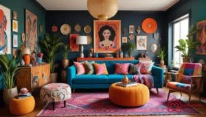
Incorporating bold colors in different rooms

Incorporating bold colors in different rooms is a fantastic way to express your style and enhance each space’s atmosphere. Each room in your home serves a different purpose, and the colors you choose can significantly affect how you feel in those spaces.
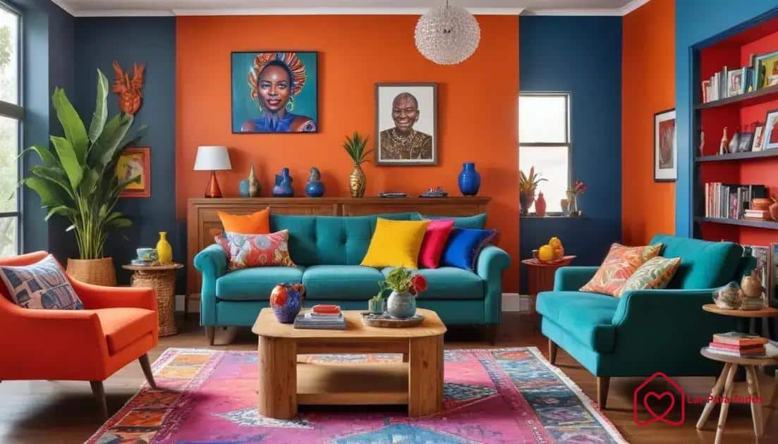
Living Room
The living room is often the heart of the home, making it a perfect place for bold hues. Consider using a bright, eye-catching color for an accent wall.
Shades like turquoise or sunflower yellow can energize the room. Pair bold colors with neutral furniture to create balance and avoid overwhelming the space.
Bedroom
Your bedroom should be a sanctuary. For this space, deep and rich colors like plum or navy blue can create a cozy atmosphere.
Use bold colors in bedding or wall art to add personality without making the room feel chaotic. Incorporating softer hues through accessories will enhance the calming effect.
Kitchens
The kitchen is another area where bold colors can shine.
Bright shades like red or lime green can stimulate appetite and energy. Consider painting cabinets or using colorful backsplash tiles to bring life to your cooking space. Mixing bold colors with an open layout can also help keep the vibes fresh and inviting.
Bathrooms
Don’t overlook the bathroom! A splash of aqua or coral can completely transform this space.
Use bold colors in tiles, shower curtains, or towels to create a fun, refreshing atmosphere. Smaller spaces can benefit from bright colors that make them feel open and airy.
When integrating bold colors, consider the lighting in each room.
Natural light can make colors appear more vibrant, so test paint samples first. Aim for a cohesive flow throughout your home while still highlighting each room’s unique personality with the right hues.
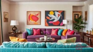
Balancing bold hues with neutrals
Balancing bold hues with neutrals is essential for creating a harmonious and inviting space. When you incorporate strong colors, neutral shades help to ground the design and prevent any one hue from overwhelming the room.
The role of neutrals
Neutrals, such as whites, grays, and beiges, serve as a stabilizing backdrop that allows bold colors to shine. Using neutrals in large areas, like walls and furniture, creates a calm setting that makes vibrant tones stand out.
You can use bold colors as accents on pillows, area rugs, or artwork, allowing them to pop without dominating the room.
Finding the right balance
A good rule of thumb is the 70-30 rule, where 70% of the space is in neutrals and 30% is in bold colors. This balance ensures that the bolder hues are visible but not overpowering. Here’s how to effectively mix them:
- Start with a neutral base for walls and larger furniture.
- Add bold accents through smaller pieces like cushions, throws, and decor.
- Incorporate accessories in neutral tones to connect different colors together.
While neutrals provide balance, it’s important to choose the right tones. For example, using a warm beige can complement warm colors like fiery oranges and reds, while cool grays work well with blues and greens.
Another approach to balance is to use patterns that include both bold and neutral colors. For example, a bold floral print can mix vibrant tones with a neutral background. This adds interest while maintaining cohesion in your design.
Creating visual interest
To avoid a flat feeling in your space, vary the textures of the neutral elements. Incorporating different materials, such as wood, metal, and fabric, can create depth and make the room feel rich and inviting.
A neutral sofa with colorful, textured cushions is a great way to bring balance while introducing layers.
Creative accents to complement bold colors
Creative accents are essential for complementing bold colors in your home. These accents can enhance the vibrancy of your bold hues and provide depth to your overall design. Choosing the right accessories and decor is key to achieving a seamless look.
Choosing the right accessories
Begin by selecting accessories that resonate with your bold color choices. For instance, if your walls are painted a daring red, consider adding accessories in contrasting shades like turquoise or gold.
These accents can provide a striking visual appeal and help break up the intensity of the bold colors.
Textiles and patterns
Textiles are one of the most flexible ways to introduce creative accents. Think about vibrant throw pillows, textured blankets, or colorful rugs that incorporate bold and complementary tones. Mixing patterns can also add interest:
- Use geometric patterns with solid bold colors.
- Combine floral prints with strong stripes.
- Choose colors from a common palette to maintain a cohesive look.
Textures matter too. Combining different materials like velvet, linen, and cotton can create a layered effect that enhances visual interest.
Artwork and wall decor
Artwork plays a significant role in tying together your design. Consider pieces that encompass your bold color schemes or incorporate tones that complement them. Large, colorful paintings can act as focal points, while smaller pieces can add subtle accents.
Wall decor like mirrors with colored frames or statement clocks can also enhance the overall decor while echoing the bold hues.
Plants and natural elements
Don’t forget the impact of greenery. Indoor plants can provide a refreshing contrast to bold colors, adding life and texture. Choose planters that match or complement your color scheme.
For example, a vibrant green plant in a ceramic pot with bold hues can tie elements together beautifully.
Ultimately, the key to creative accents is experimenting. Try different combinations and placements until you find what feels right. The right accents can create a stunning visual story that draws attention without overwhelming the space.
Trends in bold colors for 2025

Trends in bold colors for 2025 are set to redefine interior design, bringing vibrant energy and freshness into homes. As people look for ways to express their individuality, bold colors offer an exciting way to showcase personal style.
Color Psychology
Understanding how colors affect emotions and perceptions is crucial. For 2025, colors like vivid green and bright orange will dominate spaces, promoting feelings of happiness and creativity.
These shades can rejuvenate environments, making them perfect for areas where people gather.
Nature-Inspired Palettes
Natural elements will influence 2025’s color trends. Expect to see earthy tones paired with vibrant accents that mimic nature. Shades such as deep teal or rusty red will create a sense of calm while providing pops of color that invigorate your space.
Accent Walls and Statement Pieces
Accent walls will remain popular for showcasing bold colors.
Pairing a vibrant accent wall with neutral furniture allows the bold color to take center stage. Additionally, statement pieces like bright sofas or unique art can draw attention without overwhelming the room:
- Try a brightly colored chair against a neutral backdrop.
- Incorporate large artwork that features bold color combinations.
- Mixing and matching patterns can amplify the effect.
This trend encourages creativity and personal expression, allowing homeowners to play with color combinations that feel right for them.
Mixing Vintage and Modern
In 2025, there will be an increase in blending vintage furniture pieces with bold colors. This trend offers a unique character to spaces while maintaining a contemporary feel.
Imagine a classic mid-century chair in electric blue paired with a sleek, modern table. This mixing will create visual interest and charm.
As homeowners embrace bold colors, the trends for 2025 reflect a desire for self-expression and an appreciation of the environment. Exploring new color combinations and innovative designs will lead to stunning interior spaces that feel alive and inviting.
FAQ – Common Questions About Using Bold Colors in Home Design
How can I choose the right bold colors for my space?
Consider the size and lighting of your room. Use lighter bold colors in smaller spaces and deep tones in larger areas to create the desired atmosphere.
What are some tips for balancing bold hues with neutrals?
Follow the 70-30 rule: use 70% neutrals and 30% bold colors. This helps maintain harmony while allowing bold tones to stand out.
How do I incorporate bold colors in specific rooms?
Use bold shades in accent walls, furniture, or accessories. Each room has its unique needs; for example, use calming colors in bedrooms and energizing colors in living areas.
What trends in bold colors should I follow for 2025?
Expect vibrant hues like vivid greens and earthy tones paired with bright accents. Mixing vintage and modern styles will also be popular.
Incorporating bold colors into your home design is a fantastic way to express your unique style and revitalize your spaces. By combining daring tones with neutrals and creative accessories, you create harmonious rooms full of life and personality.
Whether on accent walls, furniture, or small details, the secret lies in balance and experimentation.
With 2025’s trends inspired by nature and the blend of vintage and modern styles, your home can become a true reflection of who you are.
To explore more possibilities and clear any doubts about using vibrant colors in your decor, check out this comprehensive guide: How to Use Bold Colours to Transform Your Living Space.
Now is the perfect time to transform your home with boldness and style!


