Sage green interiors South Africa: a calming trend
Advertisements
Sage green interiors South Africa are particularly relevant in 2026 as muted greens move beyond accent color and become versatile foundations for contemporary residential spaces.
Inspired by natural landscapes, sage can work with bright South African light, warm timber, stone, linen, ceramics and locally crafted decorative pieces.
The strongest interiors use the color as part of a layered material palette rather than relying on sage green alone to create character or atmosphere.
Advertisements
Why Sage Green Works in South African Interiors
Sage sits between green and gray, giving it a muted quality that can appear softer than saturated emerald, forest or botanical greens.
That restraint makes it easy to introduce across walls, cabinetry and textiles without requiring every other element in the room to remain neutral.
In South African interiors, it can also connect visually with vegetation, stone, timber and the strong natural light common across many regions.
Fynbos-Inspired Greens Are Particularly Relevant in 2026
South African design coverage in 2026 has highlighted muted fynbos-inspired colors including sage, olive, eucalyptus and moss as increasingly important interior tones.
These greens can function almost like neutrals when paired with warm woods, linen, natural stone and other materials associated with the surrounding landscape.
The connection works especially well when the goal is creating an interior rooted in place rather than copying an international color trend without adaptation.
Sage Changes With the Light
A sage paint color can appear warmer, cooler, greener or grayer depending on the room’s orientation and the amount of daylight it receives.
Strong sunlight may reveal undertones that are less obvious on a small sample viewed under artificial lighting inside a shop.
Testing a large painted sample throughout the day is therefore more reliable than choosing the color from a digital screen or tiny swatch.
Sage Green Is Not Automatically a Wellness Color
Interior-design descriptions frequently associate green with calm, restoration and nature, but those associations should not be treated as guaranteed psychological outcomes.
A muted green room may feel quieter or softer to a particular homeowner because of its low saturation and relationship with natural materials.
Personal preference, lighting, room function and surrounding colors can influence the experience as much as the hue itself.
Use the Color to Shape Atmosphere, Not Promise Results
In bedrooms or living rooms, sage can create a visually restrained backdrop that allows furniture, textiles and artwork to remain the stronger focal points.
That can make a space feel less visually busy, especially when the rest of the palette avoids excessive contrast or competing patterns.
Describe the result as a design effect rather than claiming that a wall color can reduce anxiety, stress or other health conditions.
Pair Sage Green With Warm Natural Materials
One reason sage works effectively is its compatibility with tactile materials that introduce warmth and prevent muted green rooms from feeling flat.
Timber, clay, stone, wool, mohair, linen and woven natural fibres all create contrast through texture even when the color palette remains restrained.
Recent South African design coverage places particular emphasis on materials with a clear connection to local landscape, craft and production.
Wood Can Shift the Mood of Sage green interiors
Pale oak or similar light timber creates a softer contemporary combination that works well in bright kitchens, bedrooms and open-plan living areas.
Darker timber produces stronger contrast and can make the same green appear richer, particularly in dining rooms, libraries or more layered interiors.
The wood does not need to match perfectly across every piece; repeated undertones and thoughtful spacing can create enough visual cohesion.
Stone and Clay Add Grounding Texture
Stone brings variation in grain, tone and surface while clay introduces earthy warmth that can offset sage’s cooler gray undertones.
These materials can appear through floors, countertops, pottery, tiles, lamps or smaller decorative objects rather than major architectural renovations.
The combination feels strongest when individual materials remain recognizable instead of being heavily coated or disguised beneath artificial finishes.
Natural Fabrics Complement Sage green interiors
Linen, cotton, wool and mohair can introduce softness while preserving the tactile, nature-oriented character that makes sage appealing in residential spaces.
They also offer multiple levels of texture, from lightweight curtains and crisp cotton to heavier throws, woven rugs and upholstered furniture.
South Africa’s established wool and mohair traditions provide especially relevant opportunities to incorporate locally connected fibres into contemporary rooms.
Linen Creates a Relaxed Contrast
Linen curtains can soften a sage wall without producing the highly coordinated appearance that sometimes results from matching fabric and paint exactly.
Natural, cream, stone and oatmeal linen tones are easy companions because their warmth offsets the cooler side of muted green.
Visible weave and gentle irregularity add visual movement while allowing the overall room to remain relatively simple.
Wool and Mohair Add Depth
Wool can appear in rugs, upholstery and blankets, while mohair can introduce a softer, more lustrous surface through throws and selected furnishings.
Both materials are useful when a room needs tactile richness without adding another strong color or decorative pattern.
Local sourcing can also connect the interior more directly with South African makers and established textile industries.
Use Sage Green on Walls Carefully
Painting an entire room Sage green interiors creates a stronger commitment than adding cushions or accessories, so undertone and natural light become particularly important.
A pale sage can behave almost like a neutral, while deeper olive-sage shades may create a more enveloping effect in lower-light spaces.
Before painting every wall, consider flooring, fixed cabinetry and large furniture because these elements will determine whether the final palette feels balanced.
An Accent Wall Is Not Always Necessary
Accent walls can be useful when one architectural surface deserves emphasis, but they should not be the default solution for introducing color.
In some rooms, painting all walls in a restrained sage creates greater visual continuity than isolating one wall in a contrasting tone.
The decision should respond to architecture and furniture placement rather than a rule that every colored room needs one feature wall.
Sage green interiors Cabinetry Can Anchor a Kitchen
Kitchen cabinetry provides enough surface area for sage to become a major design element without requiring the walls to carry the same color.
The muted tone can pair effectively with pale stone, timber, brushed metal and warmer off-white surfaces around the rest of the room.
This approach also allows homeowners to introduce a nature-influenced palette while maintaining a relatively restrained overall kitchen design.
Balance Green Cabinets With Material Variation
A completely uniform green kitchen can lose depth, so use countertops, handles, flooring and open shelving to introduce changes in texture.
Natural stone or engineered surfaces with restrained veining can provide contrast without competing heavily with the cabinetry.
Timber shelves, stools or dining furniture can add warmth and prevent the space from becoming dominated by one painted finish.
Introduce Sage Through Furniture for Less Commitment
Homeowners who do not want to repaint can use upholstery to make sage a significant part of the room while keeping walls neutral.
An armchair, sofa, headboard or dining chair can provide enough colored surface to establish the palette without dominating every visual plane.
This method is particularly useful in rental properties or homes where permanent finishes need to remain flexible.
Let One Large Piece Lead the Palette
A sage sofa can serve as the room’s primary color cue while surrounding textiles repeat smaller amounts of green, cream or earthy brown.
Avoid purchasing every accessory in the same shade because excessive matching can flatten the visual hierarchy and make the room feel staged.
Variation in value and texture creates a more natural composition than reproducing one exact green across multiple unrelated objects.
Use Accessories for a Subtle Sage Green Interiors
Smaller decorative objects allow homeowners to experiment with sage before committing to furniture, cabinetry or an entire painted room.
Cushions, ceramic vessels, lamps, throws, artwork and rugs can introduce enough green to influence the palette while remaining easy to change.
This approach works particularly well when the existing room already contains warm timber, off-white walls or natural woven textures.
Ceramics Can Add Color and Craft Together
A handcrafted vessel combines color, texture and object form, making it more visually meaningful than filling shelves with many generic accessories.
South African ceramicists offer opportunities to bring local craft into interiors without forcing the room into a literal cultural theme.
One distinctive ceramic piece can carry more character than several mass-produced objects selected only because they match the paint.
Pair Sage Green With Cream and Warm White
Cream and warm white create one of the easiest supporting palettes because they preserve brightness while softening contrast against Sage green interiors.
This combination works across contemporary, country-inspired and more minimal interiors because neither color depends on strong pattern or ornament.
The result can still feel layered when flooring, furniture and textiles introduce different natural materials across the room.
Avoid Automatically Choosing Stark White
Cool brilliant white can sometimes exaggerate gray undertones in sage or make a room feel sharper than the homeowner intended.
Warmer whites and creams may connect more naturally with timber, clay and woven fibres, particularly in rooms receiving intense daylight.
Always compare samples within the actual space because the surrounding light can alter how both green and white appear together.
Earthy Colors Create a More Grounded Palette
Terracotta, clay, rust, ochre and warm brown can move a sage room away from a cool botanical look toward a richer earth-based composition.
The combination is particularly effective through smaller accents because stronger warm colors can provide depth without overwhelming the muted green foundation.
Natural leather, timber and pottery can achieve a similar effect without introducing another painted color at all.
Use Contrast in Controlled Amounts
A rust cushion or ochre artwork can be enough to interrupt a predominantly sage-and-neutral room and create a more intentional focal point.
Repeating the contrasting color once or twice elsewhere helps it feel connected rather than accidentally introduced.
Restraint is useful because a muted green loses its role as the foundation when too many highly saturated accents compete around it.
Dark Colors Can Make Sage More Sophisticated
Charcoal, espresso brown and black accents can add definition to sage interiors through lighting, frames, cabinetry hardware or occasional furniture.
This deeper contrast can be particularly useful in rooms that otherwise contain many pale neutral surfaces and risk feeling visually washed out.
Dark elements should remain deliberate rather than evenly scattered through every accessory simply to create contrast.
Navy Can Work as an Alternative
Navy and muted green share enough depth to coexist while producing more color than a black-and-sage combination.
The pairing works especially well when separated by cream, timber or another warm neutral that prevents the two darker colors from feeling heavy.
Textiles and artwork provide an easy way to test the combination before introducing larger permanent finishes.
Modern Minimalism Works Well With Sage
Minimalist interiors can use sage as an alternative to gray or beige without losing their emphasis on simple forms and limited visual clutter.
Clean-lined furniture allows the color and materials to carry more of the room’s character instead of depending on numerous decorative objects.
Sage also pairs naturally with pale timber, stone and restrained textiles commonly used in contemporary minimalist spaces.
Minimal Does Not Need to Mean Empty
A successful minimalist room still needs practical lighting, comfortable seating, useful storage and objects that reflect how the household actually lives.
Sage provides a background rather than a substitute for those functional decisions, so color should follow the needs of the space.
Removing unnecessary clutter can strengthen the composition, but personal belongings do not need to disappear for the style to work.
Layered and Eclectic Rooms Can Use Sage green interiors Too
Sage is restrained enough to function alongside patterned textiles, artwork, ceramics and decorative pieces in more layered interiors.
Instead of competing with every object, it can provide a visual pause between stronger colors and more complex surfaces.
This makes it particularly useful when contemporary furniture shares a room with handcrafted or inherited pieces.
Pattern Should Have a Clear Relationship to the Room
Floral, geometric and abstract patterns can all work, but selecting them solely because they contain sage green can produce an overly coordinated result.
Look instead for complementary scale, craftsmanship and color relationships that connect naturally with the surrounding furniture and materials.
A patterned textile can become a focal point while the sage background keeps the rest of the space visually controlled.
South African Design Is Not One Decorative Style
Contemporary South African design draws from many communities, landscapes, materials, histories and creative practices rather than one standardized visual vocabulary.
Reducing it to “traditional patterns,” baskets and earthy colors risks flattening a highly diverse design culture into a generic decorating theme.
A stronger approach is to focus on identifiable makers, materials, regions and techniques while allowing contemporary design and heritage to coexist.
Place and Material Matter in 2026
Current South African design coverage emphasizes connections between local materials, craftsmanship and the specific places where interiors are created.
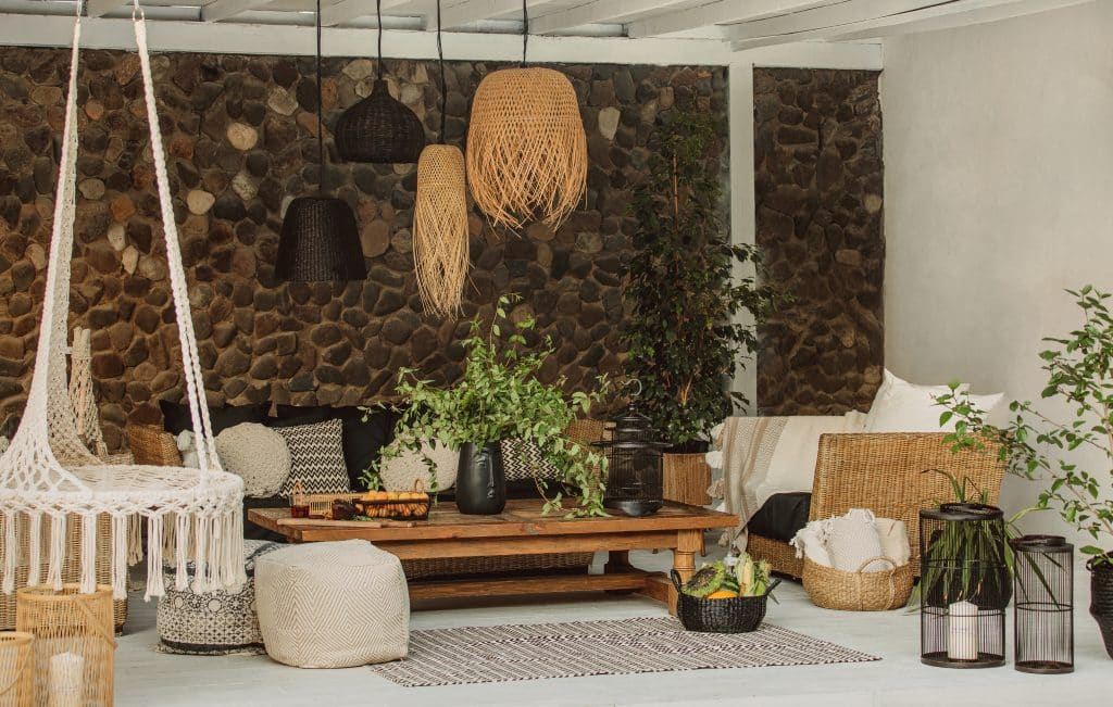
Stone, clay, timber, reeds, wool and mohair all provide examples of materials that can connect a room with local production and landscape.
This material-first approach creates more authenticity than simply adding decorative objects intended to make a room look generically “African.”
Use Woven Craft With Context
South Africa has diverse weaving traditions that continue to appear in contemporary baskets, vessels, textiles and functional household objects.
These pieces can provide texture beside sage walls while also representing individual makers, communities and material traditions rather than generic ethnic decoration.
Where possible, learn who produced the work and how it was made instead of purchasing a mass-produced imitation of a traditional object.
Woven Pieces Can Remain Functional
Baskets can store blankets, books or household objects while also introducing natural fibre and handmade texture into the room.
Larger woven vessels can stand independently as sculptural elements without requiring additional decorative clutter around them.
The combination with sage works because both materials can reference nature while still maintaining clearly different textures and forms.
South African Art Can Carry the Strongest Identity
Original artwork offers a more meaningful way to establish cultural and personal identity than trying to reproduce a generalized national aesthetic through decor.
A contemporary painting, print, photograph or textile work can sit naturally against sage while introducing colors that expand the room beyond green and beige.
The artwork should be selected because of its creator and its connection with the homeowner, not simply because it matches a preselected palette.
Let Artwork Lead Instead of Matching It
If an artwork contains strong reds, blues or yellows, the rest of the room does not need to repeat every one of those colors exactly.
A restrained sage wall can instead provide enough visual quiet for the piece to retain its independence and importance.
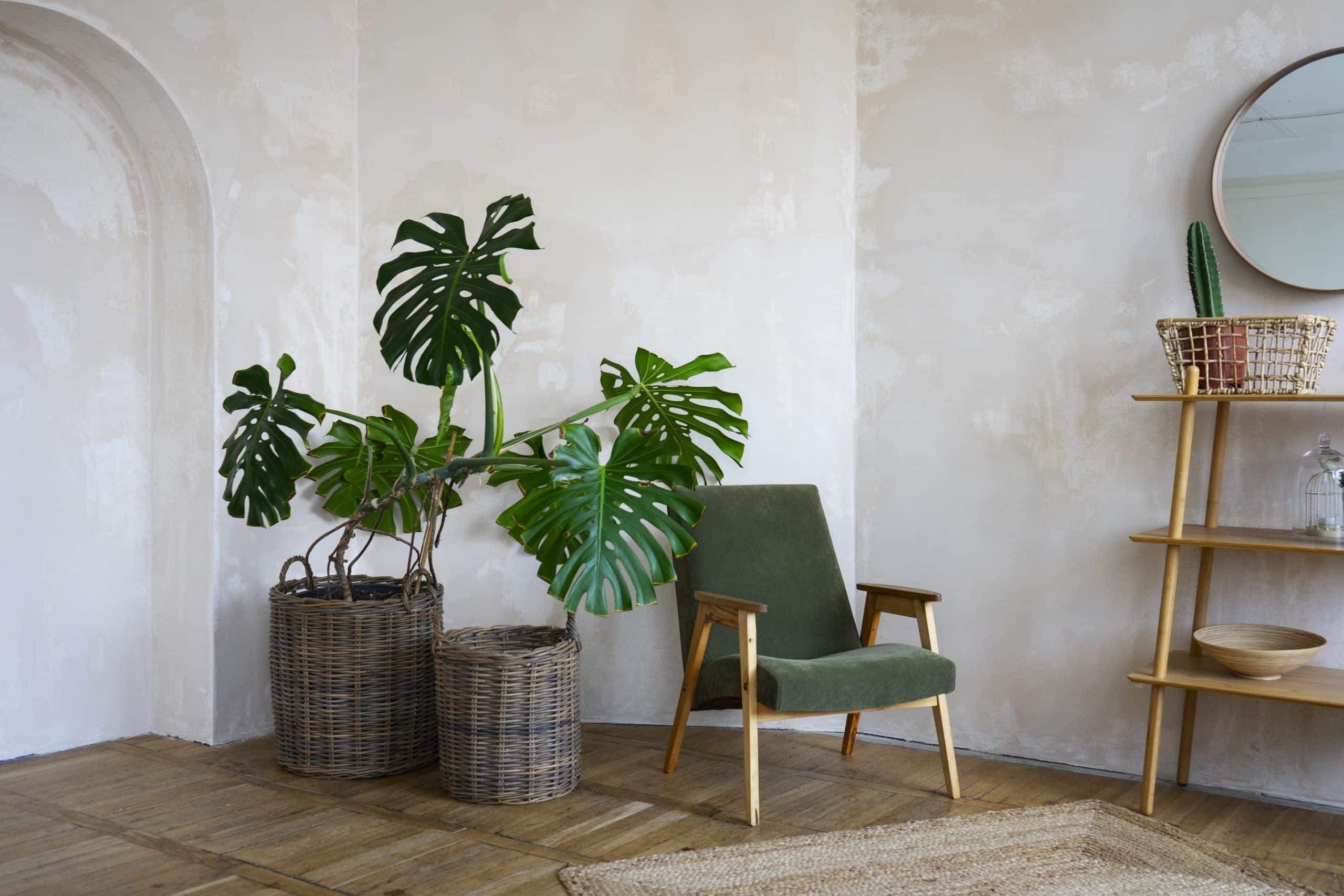
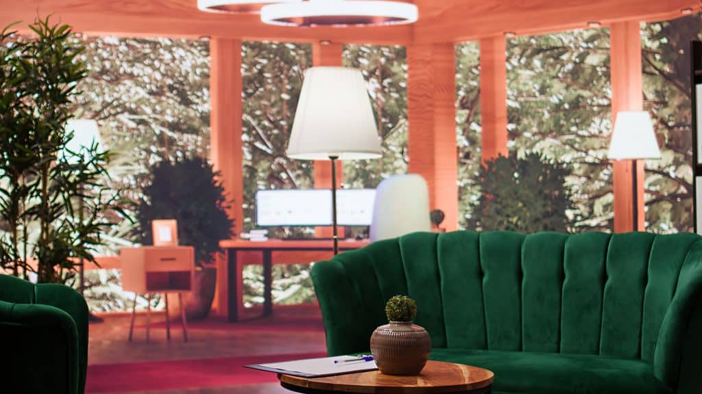
Readers looking for additional visual references can explore this collection of sage green interiors.
Mix Contemporary Furniture With Local Craft
A clean-lined sofa or dining table can provide a simple foundation for handcrafted ceramics, woven pieces, textiles or locally designed lighting.
The contrast avoids turning heritage objects into a complete theme while allowing their materials and craftsmanship to remain visually important.
This type of layering reflects the increasingly contemporary character of South African interiors rather than presenting tradition and modernity as opposites.
Buy From Makers When Possible
Locally produced furniture and decorative objects can introduce materials, techniques and stories that mass-market accessories cannot easily reproduce.
Knowing who made an object also creates a more direct connection with South Africa’s active community of ceramicists, textile designers and furniture makers.
A few well-chosen local pieces often create more identity than filling a room quickly with many inexpensive items.
Do Not Confuse Natural Materials With Automatic Sustainability
Timber, wool, cotton and clay can suit a sage interior beautifully, but a material being natural does not automatically make every product environmentally sustainable.
Origin, production, durability, transportation, finishing and how long the homeowner keeps an item all contribute to its wider environmental impact.
Choosing durable pieces that can remain useful for years is usually more defensible than repeatedly replacing decor to follow seasonal color trends.
Local Sourcing Can Add Other Benefits
Purchasing from South African makers can support local creative businesses while making the provenance of furniture and accessories easier to understand.
Locally sourced stone, timber, clay and textiles may also create a stronger relationship between the home and its regional environment.
That connection should be evaluated alongside quality, responsible sourcing and expected lifespan rather than assumed from geography alone.
Sage green interiors Can Work in Small Rooms
A small room does not automatically require white walls, and muted sage can provide depth without necessarily making the space visually heavy.
The outcome depends on natural light, artificial lighting, furniture scale and how much contrast the surrounding surfaces introduce.
A smaller room can therefore use sage successfully when the rest of the design remains proportionate and functional.
Use Reflection and Lighting Intentionally
Mirrors can reflect available light, while layered lamps prevent the room from depending on one overhead fixture after daylight disappears.
Lighter textiles and selected pale surfaces can also balance deeper green walls without forcing the entire interior into a bright neutral palette.
Lighting should be designed for actual tasks first, with atmosphere added through secondary sources where appropriate.
Sage green interiors Can Suit Coastal Homes Without Becoming Themed
Muted green can work in coastal Sage green interiors without resorting to seashells, nautical symbols or literal beach imagery throughout the room.
Light timber, woven textures, stone, linen and generous natural light can create a stronger coastal relationship through materials and atmosphere.
Sage can then provide a vegetation-inspired color that complements rather than competes with ocean views or outdoor landscapes.
Adapt the Palette to the Specific Coast
South Africa’s coastline spans very different landscapes and climates, so one decorative formula cannot represent every coastal home.
Architecture, vegetation, prevailing light and locally available materials should guide the interior more than imported ideas of generic beach decor.
This produces rooms that feel connected to their actual location instead of merely reproducing a recognizable retail theme.
How to Build a Sage green interiors Room Step by Step
Begin with the fixed elements that are difficult to change, including flooring, countertops, built-in cabinetry and large pieces of furniture.
Choose a sage shade that complements those materials, then test the color under morning, afternoon and artificial light before committing.
Introduce textiles, lighting, art and smaller objects only after the main color relationship has been established successfully.
Repeat the Color Selectively
If Sage green interiors appears on the walls, it does not need to appear again on the sofa, curtains, rug and every decorative accessory.
A small repeat in artwork or textiles can connect the palette while still allowing other colors and materials to remain distinct.
The aim is visual continuity rather than exact matching, which tends to create a more collected and personal interior.
Sage Green Interior Combinations at a Glance
Sage green interiors works most effectively when treated as part of a wider material and color system rather than as an isolated decorating solution.
Natural textiles, locally relevant materials, warm timber and carefully selected artwork can all move the palette in different directions.
The table below summarizes several combinations particularly well suited to contemporary sage green interiors South Africa.
Choose According to the Room
A bright living area can support pale oak and linen, while a darker study may benefit from deeper timber and more concentrated contrast.
Bedrooms can use softer textiles, while kitchens need durable surfaces and finishes capable of handling moisture, heat and frequent cleaning.
The most effective combination is therefore the one that suits both the visual intention and the practical demands of the space.
Frequently Asked Questions About Sage Green Interiors
Is sage green popular in South African interiors in 2026?
Yes. South African design coverage in 2026 identifies sage, olive and other fynbos-inspired greens as increasingly important nature-based neutrals.
Does sage green reduce stress?
It may create a visually soft atmosphere for some people, but a specific interior color should not be presented as a treatment for stress or anxiety.
What colors pair well with Sage green interiors?
Cream, warm white, clay, terracotta, charcoal, navy and natural timber tones can all pair effectively with sage depending on the desired contrast.
Which fabrics work well with Sage green interiors?
Linen, cotton, wool and mohair can provide useful texture while complementing the muted, natural character of sage green.
Does sage green work with dark wood?
Yes. Dark timber can create a richer contrast than pale oak and works especially well in dining rooms, studies and layered living spaces.
Can sage green work in small rooms?
Yes. Light levels, furniture scale and contrast matter more than a rule that small rooms must always use white or very pale walls.
What makes a South African-inspired interior authentic?
Focus on identifiable local makers, materials, artworks and craftsmanship rather than reproducing a generalized collection of supposedly African patterns.
Can traditional and contemporary pieces be mixed?
Yes. Contemporary furniture can provide a clean foundation for handcrafted textiles, ceramics, woven pieces and artwork with specific cultural or regional origins.
Should every accessory match the Sage green interiors walls?
No. Repeating sage selectively while introducing complementary materials and colors generally creates more depth than matching every decorative object.
Is sage green likely to date quickly?
No color is permanently trend-proof, but muted green can function as a flexible neutral when integrated with durable materials rather than trend-specific accessories.
Conclusion
Sage green interiors South Africa work best when the color responds to local light, natural materials and the specific architecture of the home.
Fynbos-inspired greens, timber, stone, linen, wool, mohair and locally crafted objects can create layered interiors without reducing South African design to one aesthetic.
Use sage as a flexible foundation, then build personality through authentic materials, artwork and craftsmanship that connect the room with its occupants and its place.
Author